I've been having these feelings for a while, and I'm sure everyone else has been too.
I'm talking about social media sites and their designs.
I'm just saying this now at the risk of sounding jaded and old, but I'm nowhere near an old age. This is a gripe I've been having with the internet for a while now, but it's only come more into light lately with more terrible decisions made by billionaires and their ego trips.
I don't like modern website design.
When I say this, I mean the very flat black or white design, depthless backgrounds, and overall "template-y" feel to the internet. This is not all to say that the internet before didn't have a corporate standard for its websites, but you'll see what I mean when I show some examples.
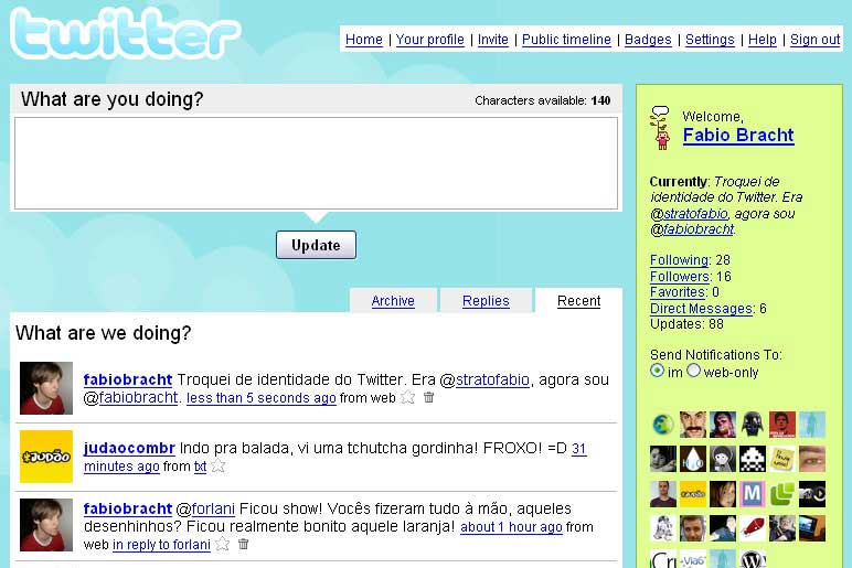
This is a site we should all be familiar with: Twitter.
This was Twitter in 2007. I mean seeing this already takes me back, but this doesn't look so claustrophobic as Twitter looks now. The charming Twitter logo at the top, the gentle cloud background that you could probably change the theme of to any picture, and what's this? No ads, useless recommendations, or news you're not forced to look at 24/7. Now take a look at Twitter now:
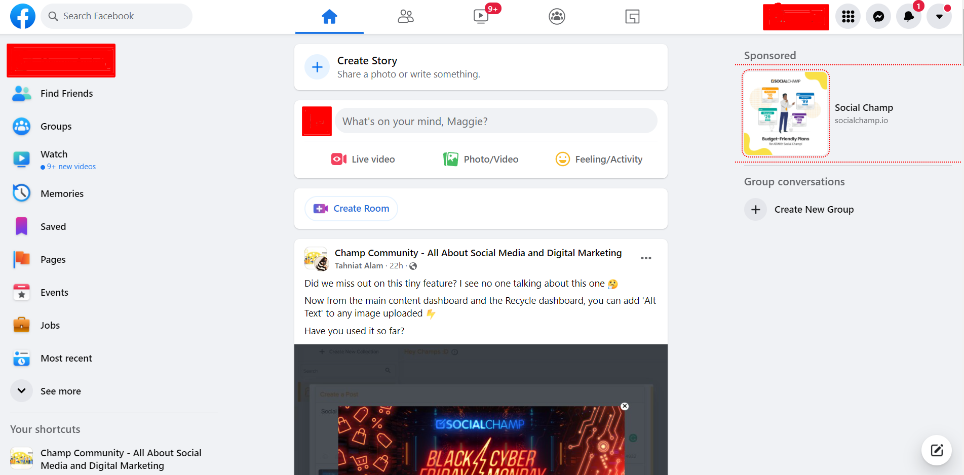
Looking at this, the gaps in the website look awful and the posts are way too condensed. And even at a glance, if the "F" icon was at the top left, I wouldn't have been able to tell you what site this was. This layout is only used for one purpose and that's specifically meant for UX-friendly design. UX is short of "User Experience" and in turn that means site design must mobile friendly too.
Even tumblr is taking on a similar design to these websites now, which is the whole reason I'm ranting about all of this. It's like a website can't try and be different anymore. Maybe this is only a niche complaint, but my point still stands, especially when I visit Neocities or the Web Design Museum. (Check these out and get a blast from the past)
It genuinely kind of hurts to see websites not take advantage of customization in favor of something they can quickly cobble together. This is not to slight the web designers that have to hard hours into these sites, they only do what they're told. Though with social media being so ingrained in society, it's hard not to copy the successes of other sites. You can't have your own website unless you have a social media page to redirect to.
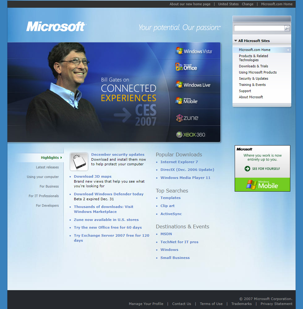
This is another can of worms that I can be grumpy about all day, but I'm not here to talk about that. Just wanted to say my piece about how every site is adopting this kind of layout and there just can't be uniqueness anymore on the internet. Anyways, Look at how Microsoft and Apple changed.
 |
 |
And also here are a couple of website designs from the Web Design Museum that I really like.








No comments:
Post a Comment